Web Form
Field Design
Best Practices
Instructional Module
Introduction
The instructional module, Web Form Field Design Best Practices, is essentially a learning resource for fundamental design principles encompassing the front end user interface design of fields and forms in the realm of web.
The module is targeted towards audience that is web literate and has an eye for basic design.
Table of Contents
What is a Web Form & Field?
A webform on a web page allows a user to enter data that is sent to a server for processing. Essentially, web form provides a stage for communication with software, individuals or businesses on the internet.
A field is the basic unit of web form. A field comes in various types to help effectively retrieve specific information from the end user.
Web forms play a vital part in every day web use. From simple contact forms to robust applications and from simple login pannels to the 'chat' features on social media websites, all use web forms. The image on the right shows a basic webform.
Web Forms rarely drive visitors to a site and they do not empower the user to take action, but the fact that they do dissuade the user from inaction makes it important to design successful web forms for effective communication.
With new web technologies and devices emerging, web form designing is becoming more challenging but the fundamental design principles provide the framework for all aspects of designing. In this module, we will discuss some of the main principles in regards to field design in web forms.
Cost Benefit and Fields
Organizations lust for information but the end user is only willing to provide minimal information so there is always a tension between the two.
Depending on the offer (reward), the bounce rate starts to increase as the number of fields increase and the accuracy of data could decline as well. Therefore, the Principle of Cost Benefit in terms of choosing the number of fields in a form is important to consider.
The number of fields on a web form is derived from the business and marketing model of a company. Ultimately it comes down to having a thorough internal discussion about which fields is absolutely required.
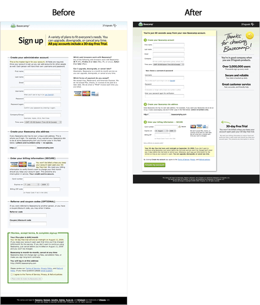
The first step towards designing a successful field is to question it's existence: is it absolutely necessary to have the field and if yes then can it be made optional? In the image on the right, this principle is evident in comparison of Basecamp's new and old sign up forms. The new design has fewer fields.
Affordance, Data Input and Feedback
Affordance is a property in which the physical characteristics of an object influence its function and the user's way of interacting with it. The Principle of Affordance is relevant in designing fields because fields can take several different visual forms and can be configured to consume different types of data. Therefore efficiency and usability of a form can significantly increase for both the business and the end user with the proper usage of affordance in designing fields for web forms.
In Nike's web form (top right), a user can enter the month, day and year of birth by clicking on the boxes and selecting from the list. The small arrows indicate the presence of a drop down select list. This design not only makes the process of entering the data more convenient for end user but also reduces human input error. Moreover, it ensures consistency of data format.
In Evernote's web form (bottom right), the username field is an easily recognizable text box which provides real time feedback in terms of the availability of a username.
Field Label Positioning
Label positioning may seem like an insignificant component of field design but there has been a fair amount of research looking at the optimal placement of labels within a form so that they facilitate scanning, understanding and form completion. General trends on the modern web and best practices tell us that:
Labels inside fields are ideal for very small forms on login panels or search boxes. For example Google Chrome Web Store's search box label is placed inside the field. The design efficiently uses the real estate.
Labels top aligned are preferred when the data being collected is familiar (e.g., a contact form). Image on the right shows three fields with labels stacked vertically on top of fields. This makes it quick and easy for the visitor to scan down the entire form. The disadvantage here is that it makes the form take up more vertical space
Labels left aligned are helpful to the user when the data being collected is unfamiliar or complex. This helps users scan down the list of labels so that they can see exactly what they will be providing before they start filling out the form.
The blue lines in the image on the right illustrate the work-flow through forms with three different labeling positions.
Field Proximity and Framing
The Design Principle of Proximity states that elements that are close together are perceived as being more related than elements that are farther apart.
The organizational meta function of framing is a tool for designers to use lines, screens, boxes etc to group elements together and to separate these elements from other elements outside the frame.
The application of framing and proximity in combination can orchestrate the overall user experience of web forms by effectively organizing fields. This is important because the scale of web forms ranges from one field forms to multi-page forms.
The images on the right shows two extreme examples. The top one shows Twitter's login form framed nicely in a box. The bottom one shows one of the four screens containing similar fields in a registration form on TD Canada Trust's website.
Visual Design and Exemplar
Finally, the skin of a web form is important. Usually the skin is consistent with the the branding of the business.
At this level, the designers must make sure that other fundamental principles of design in the grand scheme of things are in synchrony.
The interactive image on the right showscases Barack Obama's website. It not only demonstrates a proper usage of fundamental digital design principles and best practices discussed in this module but also the responsiveness to target varying real estate areas (screen sizes).
Glossary
Cost Benefit
An activity will be pursued only if its benefits are equal to or greater than its costs.
Affordance
A property in which the physical characteristics of an object influence its function and the user's way of interacting with it.
Proximity
Elements that are close together are perceived as being more related then elements that are farther apart.